Catching up on articles #1
Who this is for: • UX Designers • Product
This is the first in a series where I’m trying to catch up on articles saved in my Feedly. I have a goal of writing more and reading more design writing.
One way of upping my word count I’ve decided on, is to give a short summary of articles I’ve read and maybe a little review. Keeping my reading accountable and publishing them as a reference point for me in the future.
How many I can fit in will vary, I’m using spare time through the day while working and parenting so we’ll see how this goes. But one day to read and write, next day publish and promote. Let’s go!
Table of contents
Seven heuristics for identifying proper UX instruments and metrics
- Premium post ✋
- Essential reading score: 3/5
Good read for the right kind of designer
This is a dense research-based article for user researchers. It was an insightful read that highlighted my inexperience with a more academic approach to UX measurement. This is something I’ve set myself a goal for improving in 2023 and beyond so it was a good place to start in my article catch-up series.
The article builds on previous posts in the series that explain how conversion rate and order value aren’t good UX metrics, and how one might measure UX. It gives the reasoning behind the seven heuristics and two brief but clear case studies demonstrating them.
I have attached the heuristics without the reasoning or case studies. It, and the previous two articles are well worth reading if you are looking to measure the success of your UX endeavours in a more reliable way.
Third in a series on measuring UX:
- Conversion rate & average order value are not UX metrics
- So, how can we measure UX?
- ☞ Seven heuristics for identifying proper UX instruments and metrics Regular measuring isn’t applicable to UX Construct reliability – how reproducible
Seven heuristics for UX measurement
- Is there a paper about it
- Is there a theoretical basis
- Is the choice of items explained in detail?
- Is an evaluation of construct validity reported?
- Is an evaluation of construct reliability reported?
- Is the data that’s combined to form the metric properly normalised?
- Is the weighting of the different factors that form the metric explained?
References included in the article
- Speicher, M. Conversion rate & average order value are not UX metrics. UX Collective. Jan. 2022; https://uxdesign.cc/conversion-rate-average-order-value-are-not-ux-metrics-9d6e7e40e286
- Speicher, M. So, How Can We Measure UX? Interactions 30, 1 (2023), 6–7; https://uxdesign.cc/so-how-can-we-measure-ux-93fad8a8ddc9
- Kline, R.B. Principles and Practice of Structural Equation Modeling _(_affiliate link). Guilford Publications, 2015.
- Cronbach, L.J. and Meehl, P.E. Construct validity in psychological tests. Psychological Bulletin 52, 4 (1955), 281.
- Joint Research Centre of the European Commission. Handbook on Constructing Composite Indicators: Methodology and User Guide. OECD publishing, 2008; https://www.oecd.org/sdd/42495745.pdf
- Laugwitz, B., Held, T., and Schrepp, M. Construction and evaluation of a user experience questionnaire. Symposium of the Austrian HCI and Usability Engineering Group. Springer, Berlin, Heidelberg, 2008, 63–76.
9 Stand-Out eCommerce Web Design Trends of 2023
- Free post 👍
- Essential reading score: 1/5
9 trends that disregard accessibility (as usual)
I’m not sure why I saved this post from September. UX Planet put out some good content but they aren’t the most reliable for insightful design writing, but another trend post written by Design Studio is easy content that will get clicks, I guess. It frustrates me when UX organisations promote content that doesn’t meet one of the fundamental rules of UX, usability. If a segment of users can’t interact with your products - be it due to keyboard limitations or users technical capabilities - it can’t be an effective eCommerce platform.
Not all ‘trends’ are exclusively unaccessible but the creator of the post could at least highlight the potential issues users could face with the trend in question, informing the impressionable designers that watch for trends religiously. And to be frank about the featured trends, I don’t think there was a new trend in the bunch, which is often the case in these types of posts.
Below are the lists of trends along with featured images, my thoughts and issues with them and what good can be taken away from this waste of my time…
Animated Product Reveals
- Limited to certain types of trendy brands
- Relying on scrollable content can exclude non mouse users or trackpad
Multidirectional Layouts
- Heavy reliance on scrollability
- Features of multidirectional websites referenced were not unique to rt
- Not inherently bad, and I liked the reference to making the websites accessible to right to left languages
“For example, most eCommerce website designs are specifically optimized for left-to-right languages like English or Spanish. An eCommerce platform with a multidirectional layout can be optimized for right-to-left languages like Hebrew/Arabic as well.”
 Neubrutalism reference used in post
Neubrutalism
- Besides being an outdated trend and applicable to specific brands, I like the benefits it brings to users of all abilities. High contrast colours, minimal & simple to use navigation and clear calls to action
Creative Page Transitions
- This section in the post talks about how fast load times are important and then lists a bunch of ways to slow loading times, even listing “Flash Animated Transitions” lol.
- Creative page transitions is not really a trend. And interaction design should always be thoughtful, needless transitions that do nothing but slow loading times is not good design.
Gothic Visuals
- Very niche use for this one here. They reference Gen-Z but goth Gen-Z is a niche of a niche.
- As far as trends go, it’s not inherently problematic. It doesn’t rely on mouse interaction and could be one to draw inspiration from. But over-stylised designs rarely last.
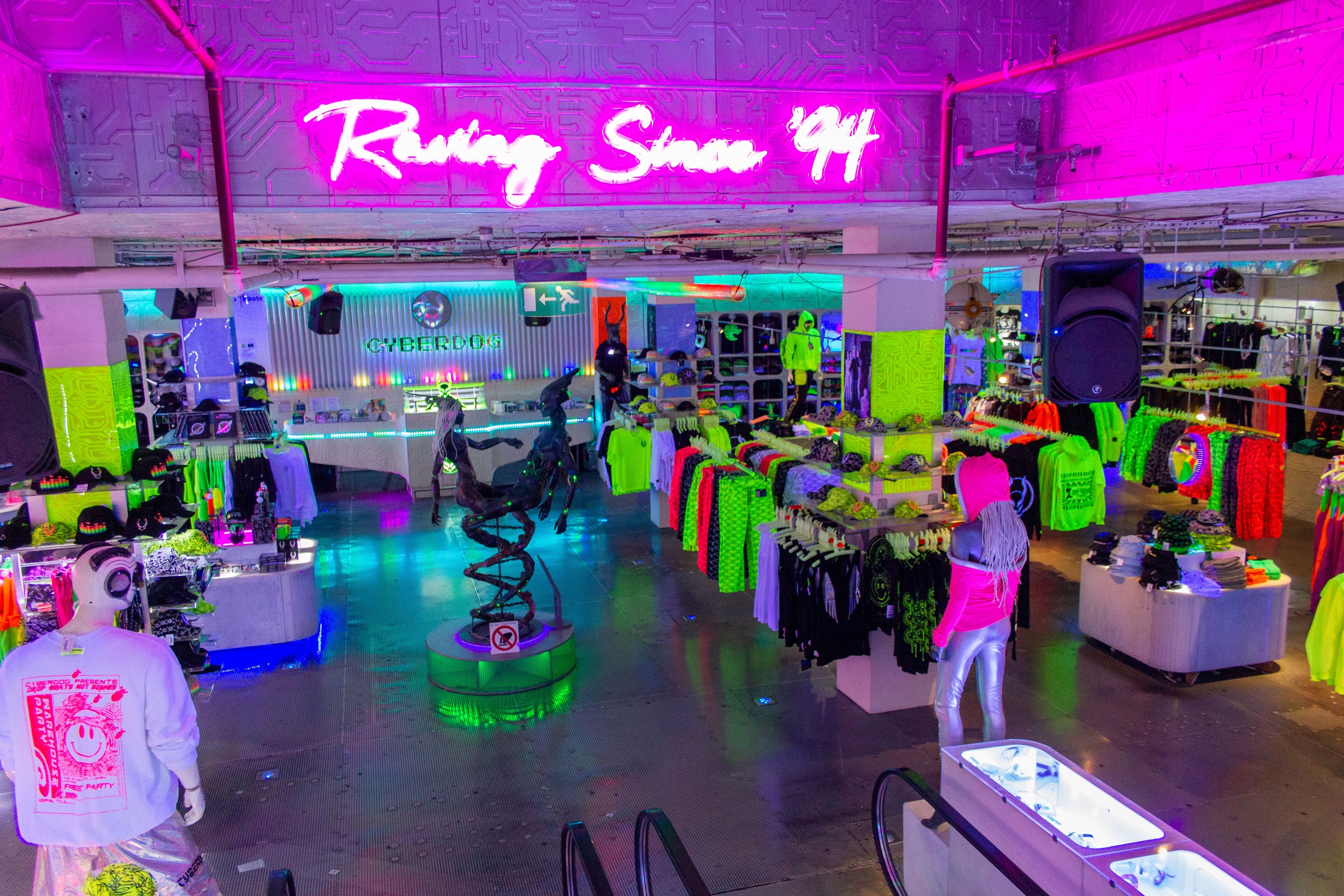 Cyberdog’s online store epitomises vaporwave (and is not for the faint of heart)
Vaporwave Aesthetics
- Vaporwave as a trend is pure chaos and if you’re interacting with the aesthetic, you should be prepared for chaos
Scrollytelling
- Think Apple promotional websites for the past ten years…
- Not particularly bad if everything can be contained in one page and keyboards and other devices are accounted for
Designing Micro-Interactions
- This is not a trend, micro-interactions are a fundamental part of web design. and their examples are literally just listing UX basics, like ‘providing feedback when users enter wrong information’, sheesh.
Mobile-First Design
- Yes, designing for other devices, what a trend 🙄
Takeaways
There are a few topics that show up in several of the ‘trends’. These are good design principles that are always relevant and should be considered for any project along with considerations of accessibility and brand fit. Below are the key design principles that repeat through this post.
Design principles
- Colour contrast
- Clever use of grids
- Well designed and thoughtful typography
- Thoughtful use of negative space
- Providing clear feedback when users require
- Thoughtful use of micro-interactions
- Responsive design
- Clear uncluttered layouts
- Use animation sparingly and maybe only for interactions
- Regular testing across multiple devices
Lessons & takeaways
The second breakdown took a lot longer than deserved, so I’m wrapping up this post here. I may choose to avoid writing about posts that I find problematic but sometimes problematic content needs to be highlighted. I will try to avoid these being dominated by negativity, at least. I am currently working on the second main release of Good Resources which I’m hoping to find a way to shorten the release cycles. So head to Good Resources for everything worth investigating in product design & development.
You can sign up to the mailing list here to be notified when release two is dropped, or give feedback and submit your own resources.